
Category: Risk Gauge
Description:
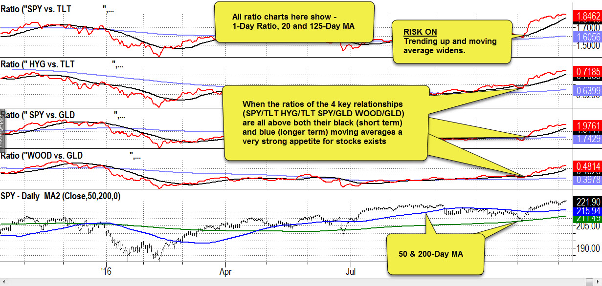
The four ratio indicators above track key intermarket relationships which identify risk on/off market conditions. These four indicators can be used together to confirm or identify the strength of the core risk on/off indicator SPY/XLU.
No indicator is correct all of the time and some relationships take longer than others to set up, so they may not not all confirm the condition represented by the SPY/XLU ratio. However, we use multiple indicators to identify periods with a stronger confirmation of the condition SPY/XLU Ratio.
The four Risk On/Off confirmation indicators are as follows:
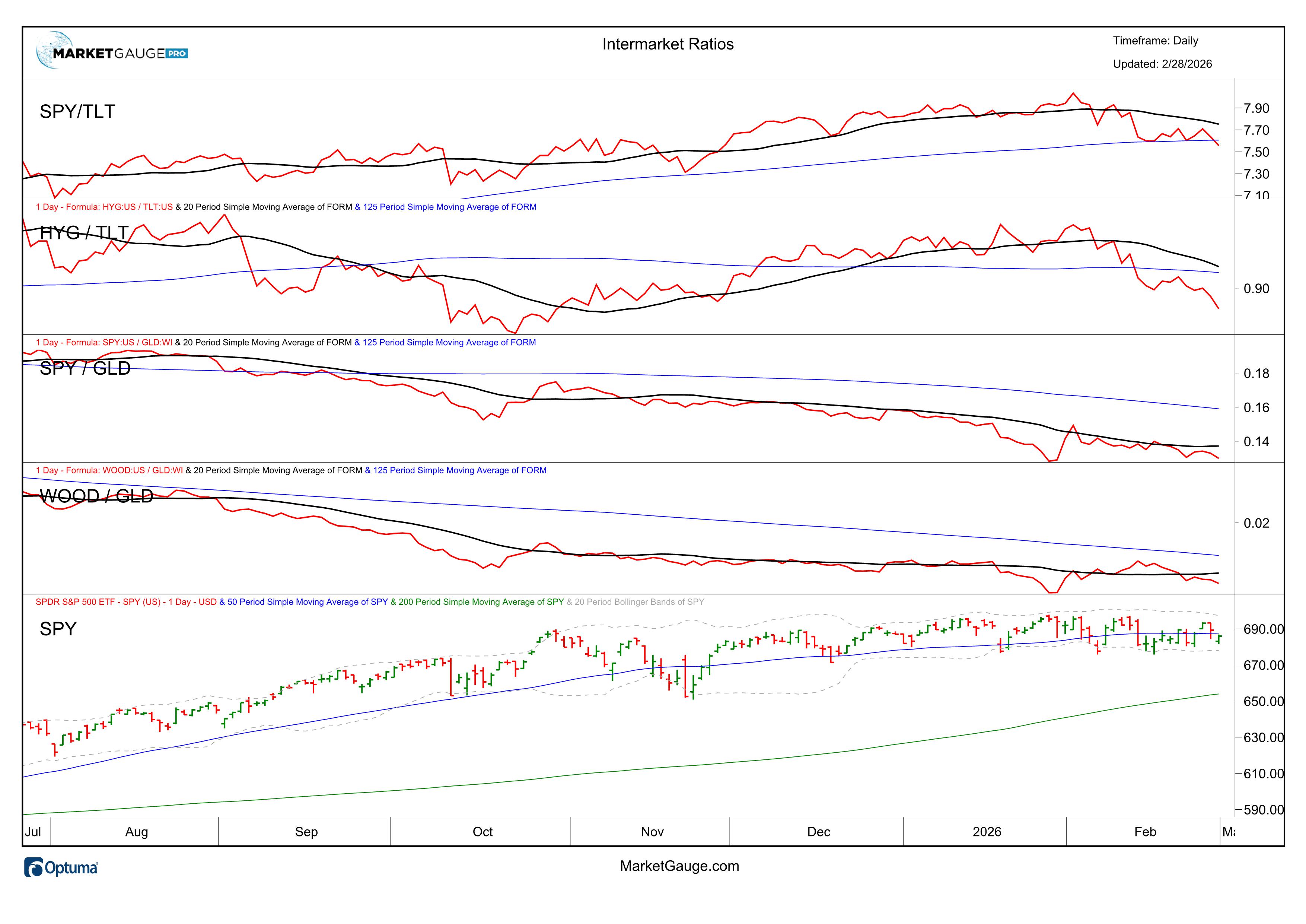
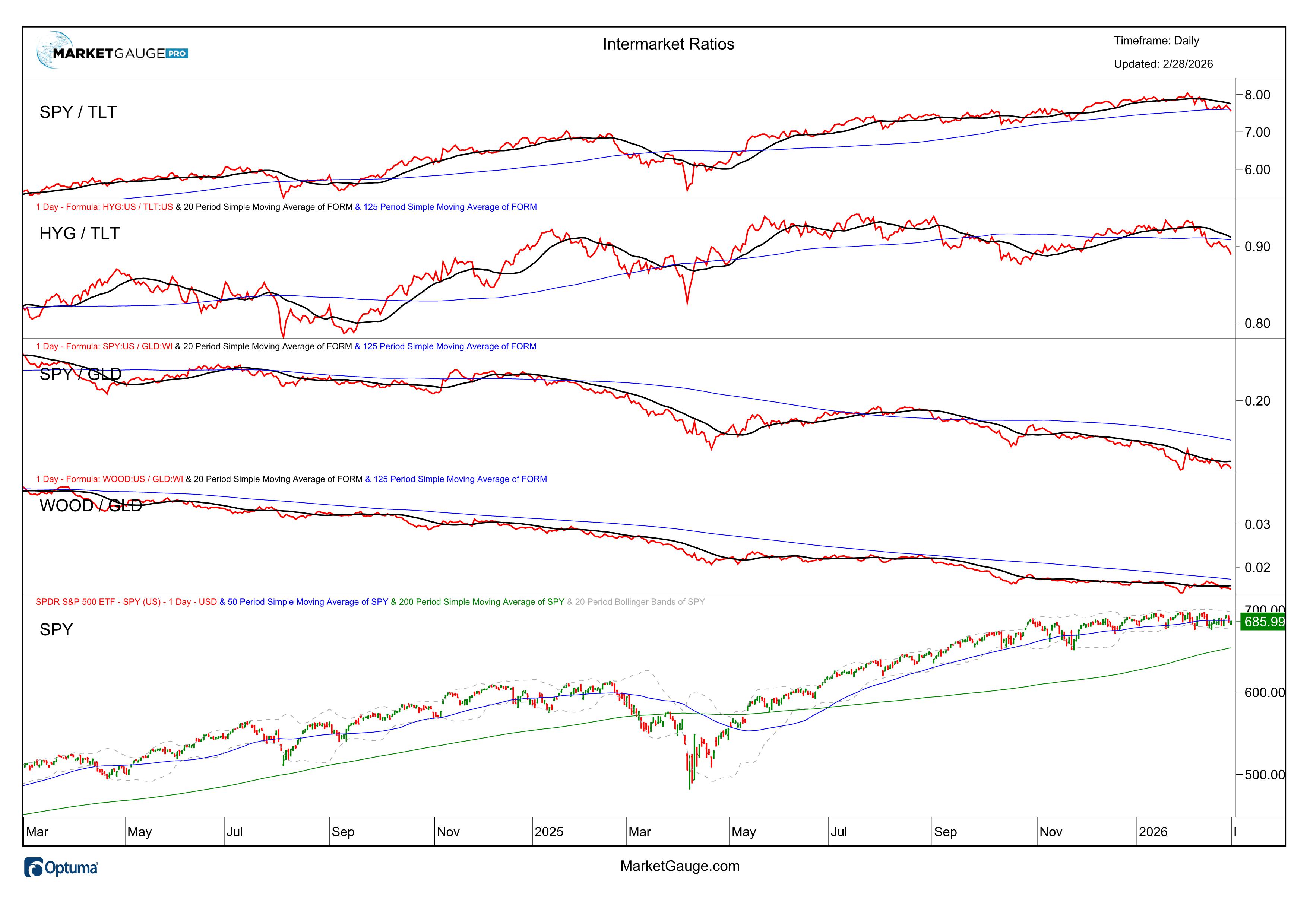
SPY vs TLT - This ratio measures the relationship between what is considered to be the safest debt instrument (U.S. bonds) versus the benchmark stock index, the S&P 500. Stocks historically offer higher returns than bonds, but they are inherently riskier. When the ratio is trending up and the distance between the ratio and the moving average widens, it identifies an increased appetite for risk in the market. This is viewed as good environment for bullish stock activity.
HYG vs TLT - This ratio measures the relationship between risky high yield corporate debt (HYG) versus the safety of U.S. Bonds (TLT). When the ratio is trending up and the distance between the ratio and the moving average widens, it identifies an increased appetite for risk in fixed income markets.
When investors are opting to hold higher levels of riskier corporate debt over safer, but lower yielding, U.S. bonds, it is viewed as bullish for stocks.
SPY vs GLD - This ratio measures the relationship between the S&P 500 (SPY) and Gold (GLD).
Gold is often used as an anxiety index or safe haven and an alternative to paper currency. Gold does not have a high correlation to stocks and its relationship often shifts.
It also sometimes acts an inflationary indicator. When the ratio is trending up and the distance between the ratio and the moving average widens, it generally identifies an increasing appetite for risk and is viewed as favorable to stocks.
WOOD vs GLD - This ratio measures relationship between gold (GLD) and lumber (WOOD).When this ratio is trending up it indicates that the relative performance of lumber is improving versus gold.
Lumber is a key input into construction which tends to increase in strong or improving economic conditions. When the ratio is trending up and the distance between the ratio and the moving average widens, it serve as a good risk-on indicator.
The four upper charts are all ratio charts and can be read the same way as described below.
The Ratio Indicator Outputs:
Each ratio charts and has three outputs. The red line is the actual daily value of the ratio. For this analysis, the precise value of the ratio is not always important, rather we focus on how that value changes over time (trending up or trending down). The blue moving average represents a 6-month average of the ratio and the black line represent 4-week moving average of the ratio.
How to Use the Ratio Indicators:
When the daily value of the ratio (red line) is over the black (4 weeks) moving average it is considered bullish for U.S. equities or a "Risk On" environment. We use the same concept for longer term readings and confirmation of the shorter term reading by looking at the ratio relative to its 6-month moving average. Absolute levels of the indicator can be utilized as support or resistance levels as well classic chart readings techniques which include slope and the use of trend lines.
Reading the Price Chart:
Lower Chart - This is a daily chart of S&P 500 ETF (SPY) with a simple 50-day (blue), and 200-day (green) moving average.
For a complete review of how to use basic price chart with moving averages please click here:
https://marketgauge.com/resources/mishs-daily-articles/the-power-of-the-200-day-moving-average/

Triple Play Trading gives you 3 unique indicators that enable you to:
The Triple Play Trading Course will teach you Trading Strategies for:

Real Motion Trading gives you unique indicators that enable you to:
The Real Motion Trading Course will teach you Trading Strategies for:
Slingshot Setups
We've identified 10 trading setups that we use to systematically identify low risk high reward trades. We call them "Slingshots" because they lead to quick bursts in price action, and they include more than just patterns - that's why we call them "Setups".
Slingshot Setups is an online streaming video training course designed to give you trading rules that you need to swing or day trade these powerful setups. We show you 'Exact' entry points, stops, targets and trailing profit-taking exits... everything you need to score BIG in the markets is included.
Because these setups begin with daily charts, you can identify which stocks you are going to trade BEFORE the trading day begins. This allows you to create a short list of great trading opportunities and then you can turn your focus on trading the specific entry and exit rules rather than feeling trading anxiety or over-analyzing the market action.
Why We Love Slingshot Setups
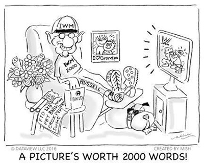
The Russell 2000 is the best measure of the health of the U.S. economy. The ETF IWM is the financial instrument that represents the direction for this index. It is a leading indicator for how much follow through the other three major indices (the S&P 500 (SPY), NASDAQ 100 (QQQ) and the Dow Jones Industrial Average (DIA) might experience. This index represents 2000 small cap stocks, which manufacture and distribute goods and services primarily within the United States.
The Russell's are "Granddad!" With 2000 stocks in this index, companies such as La-Z-Boy, World Wrestling Foundation, Crocs, Frontline, and Smith and Wesson, represent the "meat" of the U.S. economy.
Granddad guides you to observe how the "meat" of the U.S. small cap companies is performing. This information, allows you to assess independently and effortlessly the pulse of the economy and the market. However, the IWM does not stand alone.
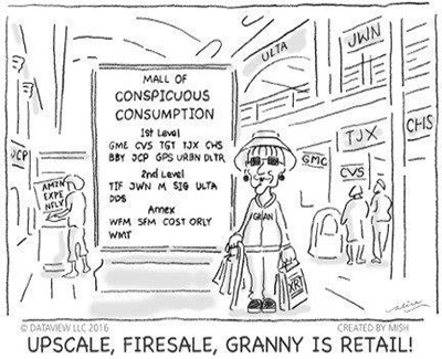
Grandma is the Retail sector (XRT); after all, she controls the family budget. As 70% of the Gross Domestic Product (GDP), Granny Retail tells us whether consumers are out there doing their part to stimulate the economy.
As an accurate measure of consumer confidence, the Retail sector must keep up with or lead the indices for sustained rallies. That makes Granddad and Grandma a perfect pair. If they are both performing well, most likely so is the overall market. If they are both feeling poorly, that is extremely helpful information. If they are going in opposite directions, take that as a sign of caution.
Granny Retail is in a "typical" mall within the United States. Stores such as Nordstrom's, GameStop, Wal-Mart, Costco, TJ Maxx and O'Reilly Automotive, XRT consider the shopping habits of most U.S. consumers.
Granddad and Grandma have four grownup kids.
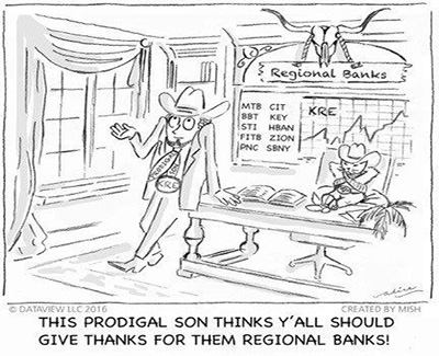
Brother Regional Banks (KRE) is the Prodigal Son. He has periods of wastefulness coupled with periods of high productivity; KRE tells us the borrowing and saving habits of the American consumer.
Regional Banks is a key sibling in the Modern Family because he measures the health of the U.S. Regional Banks, where many local folks put their money. In the cartoon, KRE, the Prodigal Son stands in his office at a Regional Bank. He tends to be Bullish on America. He leans on his desk for support. He's always ready to ask for forgiveness just in case he cannot do right by his customers. His cat (or one might say KRE's alter ego), on the other hand, has unabashed confidence that whatever the Regional Banks do is always the right thing at the right time.
KRE is a reliable indicator of what the Federal Reserve might do regarding raising or lowering interest rates. It also helps market analysts calculate consumers saving and borrowing habits. Regional Banks has a Transgender sibling.

In the cartoon, Transportation (IYT) is transgender because IYT is a variable and ever-changing element of the US economy. In today's world, the nature of how goods and services move through the economy is shifting with e-commerce and the internet. Nonetheless, how IYT is behaving continues to be very important. Our Trans is an airplane pilot who is also skilled at truck driving and freight train conducting. He/she will bring you the "goods" via trains, planes and automobiles.
If we go back in time, Charles H. Dow, co-founder of Dow Jones and Company, observed the patterns of what occurred in the markets during the Industrial Revolution, when the U.S. was a growing power. The Dow Theory originated from his observations. The Transportation Index is a key component. Dow's first stock averages were an index of industrial (manufacturing) companies and rail companies. To Dow, a Bull market in industrials could not occur unless the railway average rallied as well, usually first.
We have come a long way since Dow's Theory on how goods and services move. However, the notion of how much and how fast goods move throughout the country remains a critical measurement of the U.S. economy.
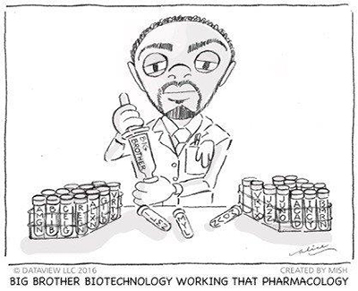
Biotechnology (IBB) made the cut for good reasons. As the anointed "Big Brother" IBB is a great way to assess if, how and where money flows into the market.
Big Brother has many functions in the United States. He represents the pharmaceutical companies because of the power they have over us as consumers. Our current health and future well-being rely on Big Pharma. Big Brother wields power in Washington D.C. as well. All the IBB holdings appear in NASDAQ. Leading medical research requires speculative funds, and if speculative funds are coming into the market, that helps rounds out the Family.
IBB serves as a lead indicator of how much speculative money is flowing into the overall market. The more optimistic investors feel in general, the more they are willing to speculate in Biotechnology. The more they speculate, the better the outcome. If Big Brother is happy, that happiness becomes contagious. We typically see that spread to the rest of the Modern Family.
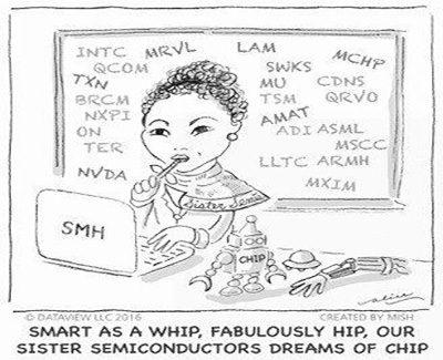
Finally, there's the precocious youngest sibling, Sister Semiconductors (SMH). The U.S. Semiconductor industry has been a major innovator among all U.S. industries.
The Semiconductor Industry is the newest industry among the Modern Family. Economists estimate that all productivity growth during the current decade will be IT (Information Technology) based by both using and producing IT industries. The basis of the very growth of humanity is IT. At its core is Semiconductors.
Per the analysis of data from the U.S. Bureau of Labor Statistics (BLS), the U.S. semiconductor industry now employs almost 250,000 workers directly and supports more than 1 million additional jobs throughout the broader U.S. economy. These supported jobs do not even include the millions of downstream electronics jobs in the U.S. that semiconductors enable.
Sister Semiconductors sits at her computer pondering ways to improve all aspects of human life. Her "pet" robot, named Chip, reminds us that automation, artificial intelligence and big data are now a part of our everyday existence.